PHOTO TOUR 1 of 2
Proper Food: Simple & Honest by Design
A fast-growing grab-and-go food company extends its clean, modern architectural brand across diverse locations.
10+ SAN FRANCISCO
LOCATIONS
LOCATIONS
- Multiple Locations - National
- Commercial
- Fast Casual, Rollout
OUR SOLUTIONS
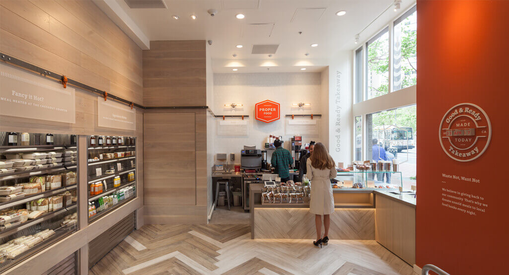
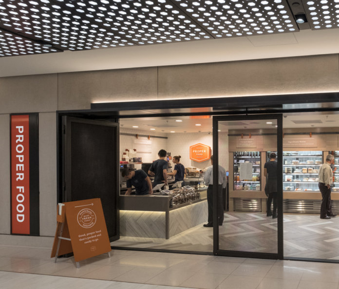
An elegant modern aesthetic, an ergonomic flow, and direct lines of sight to the product make for an easy and efficient customer experience. To ensure brand continuity, we adapt the established palette—neutral wood, stainless steel, bright orange accents—to complement each unique space, fine-tuning so the design evolves with the company.
SIMPLE AND EFFICIENT
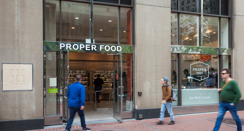
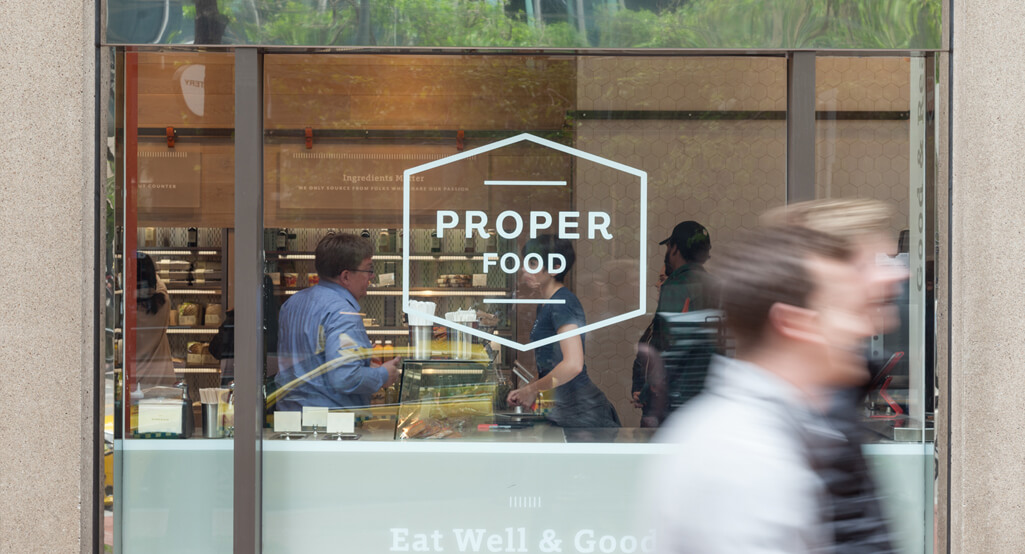
Clean and sleek food cases, brightly lit and visible from outside, draw customers into the store.
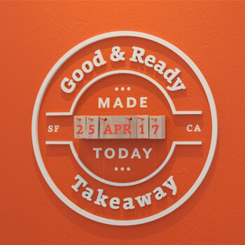
Bold orange accents, echoing the company’s logo, offer pops of color against the neutral palette of wood and stainless steel.
THE RESULT
Straightforward, elegant materials and thoughtfully organized interiors reflect the company’s simple, honest philosophy. Fresh and refined, each store boasts an easy, efficient environment that looks as good as its handcrafted food tastes.
VIEW Commercial PORTFOLIO
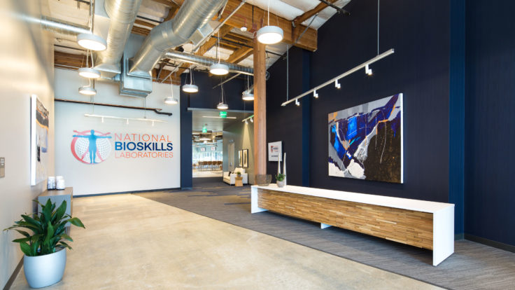
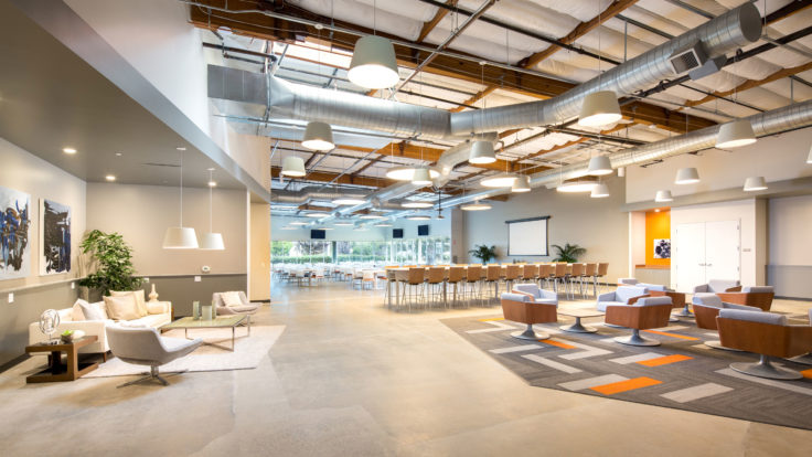
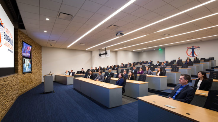
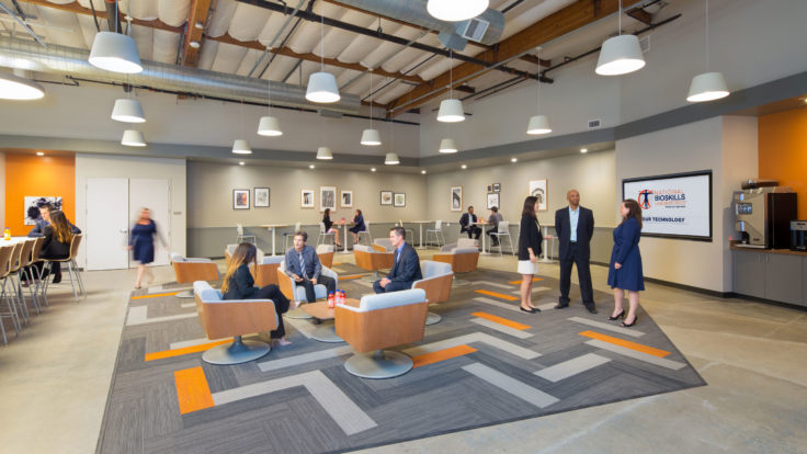
Bay Area Bioskills Training Center Gets a Design Infusion
TYPE: Training Facility
LOCATION: South San Francisco, CA
VIEW PROJECT