
5 Innovative Design Ideas to Make Your Dental Office Shine
A dental office is more than a place of business. This space speaks for your practice. It telegraphs how you serve your clients, what sets you apart, and what makes you unique. How can you ensure that your office says the right thing?
Through our experience designing dental offices, we’ve developed five inventive ways to help your new space connect with clients, represent your brand, and outshine the rest.
Rethink the reception desk
Dental reception areas have come a long way in the past few decades, morphing from the impersonal “hole-in-a-wall” with a sliding window to an open reception desk within the waiting room. We believe speaking to a client through a window signals an “us vs. you” attitude, while a reception desk within the writing room signals “we are all in it together”. And as technological devices get smaller and the need for paper and files decreases, we see an opportunity to shrink the reception desk, a move that saves valuable floor space and lowers construction costs.
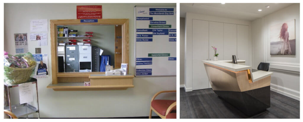
The impersonal check-in wall of years gone by vs. today’s compact open reception desk Balance technology and the human touch
As technology evolves, it may be possible to remove the receptionist altogether. Yet, we don’t necessarily recommend this. While check-in functions can be automated with tablet computers (and this is great!), there is no substitute for a welcoming human presence. A great receptionist or concierge to greet clients, answer questions, and calm nerves will help people feel comfortable in your space and, consequently, in your care.
Take a seat, have a drink
Speaking of comfort, we believe the ubiquitous rows of institutional, straight-backed chairs have no place in a dental office waiting area. Rather, we model these spaces after well-appointed, contemporary living rooms, adorned with attractive furnishings and interesting artwork. Beverage stations offering coffee, espresso, or cucumber water introduce another level of hospitality, signaling to clients that, in your practice, they come first.
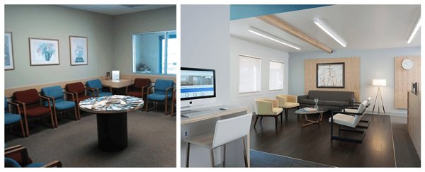
This traditional waiting area (left) calls to mind a place where you wait until your number is called. In this client-focused waiting area (right), the client rests in comfort in a hospitable, living-room like space. Let there be light (but not in my eyes)
Lighting is an often overlooked design element that impacts the client experience. In operatories, we often completely eliminate downlighting, which can be particularly bright and unpleasant when reclined in the dental chair. Tuck lights into ceiling soffits or above cabinets to create a softer, reflected light that infuses the room and doesn’t blind the client. Using LEDs over fluorescents and paying attention to the qualities of light make for a more nuanced atmosphere where clients see light, but don’t see the lights.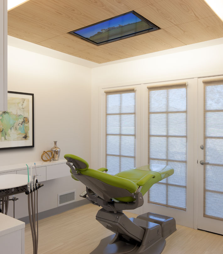
This operatory contains no direct lighting. The dropped wood panel features a flush-mounted television and houses hidden light fixtures. Include something that delights or surprises
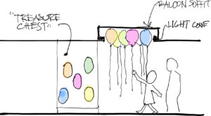
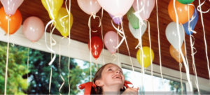
Instead of glaring lights, we prefer to stun clients with an unexpected feature that ties to your distinct brand. This element could relate to your practice’s personality, aspects of your client population, or something else that makes people take note. For one client we designed a striking reception area, noteworthy for its elegant materials, sophisticated artwork, and intricate detailing. For a pediatric dentist, known for rewarding young clients with helium balloons, we incorporated a creative balloon “holding pen” into the hallway’s ceiling design. As you can imagine, the delightful or surprising feature can vary widely depending on the particular practice. The important thing is that this unique element—along with the rest of the office space—enhances the clients’ overall experience and makes a long-lasting positive impression.
** Learn more about how Martinkovic Milford Architects can assist you with your practice.
Connect with us here

